I have been working towards these images for a long time, that doesn't mean these are 'done' and I am moving on to...well, whatever I would move on to. BUT as these images came together, for the first time I saw all of the issues and ideas I have been stirring around for so long seem to click firmly together. There are some tall orders in all of that mix, the first two are:
Quality: The image overall and its constituent parts have to maintain at the least the potential for pristine, sharp forms.
Scale: Scale is part of the experience, and for these at least that means the scale should challenge human dimensions. That doesn't just mean bigger is better, it isn't, but the images should be big enough to wrap around a visitor's peripheral vision. And, addressing both of those points, scale cannot come at the cost of quality.
There are a lot of bits to that...quality is sort of negotiable in places there are things that I saw in the individual images that I thought were mistakes. In the context of the whole composition, those mistakes become some of my favorite parts.
There are other ideas going on, but thats start. I will point out the term "picture space"...it will come up a lot, if not in that exact term then in variations and synonyms...at the end of the day space, illusions of space, actual space, and most important what I will call modernist space are the core subjects of all of my work. That might get explained further, especially the idea of modernist space but for now I will leave it at that.
I had visited this bridge a few times before, it is the old railway line that connects the B&M Baked Bean factory in Portland to East End Beach on the Portland peninsula. I had never visited the end of the bridge that connects to East End Beach though. When I got there I discovered that a huge portion of the bridge had been burned, a lot of people would see a lot of things in that...all I saw a deep rich blacks, satin smooth textures and great contrasts, all on top of the structure and rhythms of the beams and negative spaces.
Thats the setup, now some work.
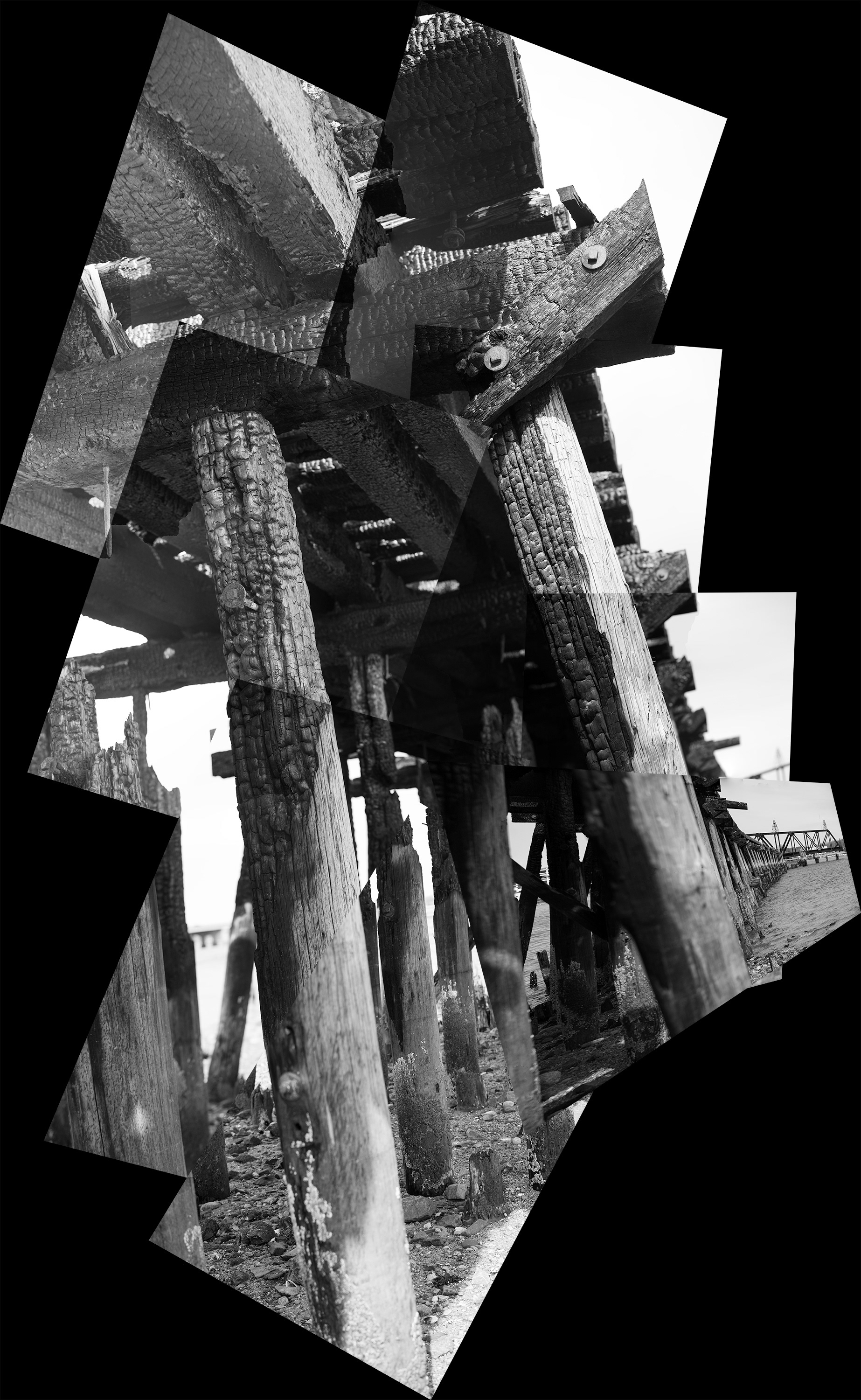
This was the first image I assembled, though it was probably one of the later sets shot in one 90 minute session. There are lots of things I don't like about this image, and I will probably revise the hell out of it and repost it further down the page. But this was a great learning image.
In this case, I didn't do a lot of the first round post processing that the images below had, I was in a hurry to see how Photoshop would deal with the disparity of images. I felt a little guilty at that point, the new version of Photoshop is really fast and pretty smart, it did a lot of work to assemble the images but also to create masks that let the images blend together effortlessly. I decided, I don't like that and most of the work I did on all of these images is undoing the what Photoshop did. I didn't undo it all and if you know what you are looking for, there are vestiges of the software's intelligence visible. It is impressive but, seamless is not the same as quality and those rough edges and abrupt transitions are important.
I also wanted to play with the ground, this is the only image, so far, that has a black ground. So far I can only imagine how this would look on a wall and that the effect on the picture plane that deep black will have on the push and pull of the perceptual picture space. Remember, the intent is to print this using traditional silver based photographic paper. ( just REALLY BIG) While there is a part of me that is doing so because I don't want to get the hate mail I would get from a printer when I went through a gallon of black ink, I also want those deep solid, bottomless blacks that come from a silver print...so, lets try it.
There are a lot of contrasts at work in these, I want photographs that behave like paintings, images which are referential but function as strongly, or more strongly as compositions built on tight rhythms, complex textures, sculptural tonality and references to elaborate modernist pictorial spaces.
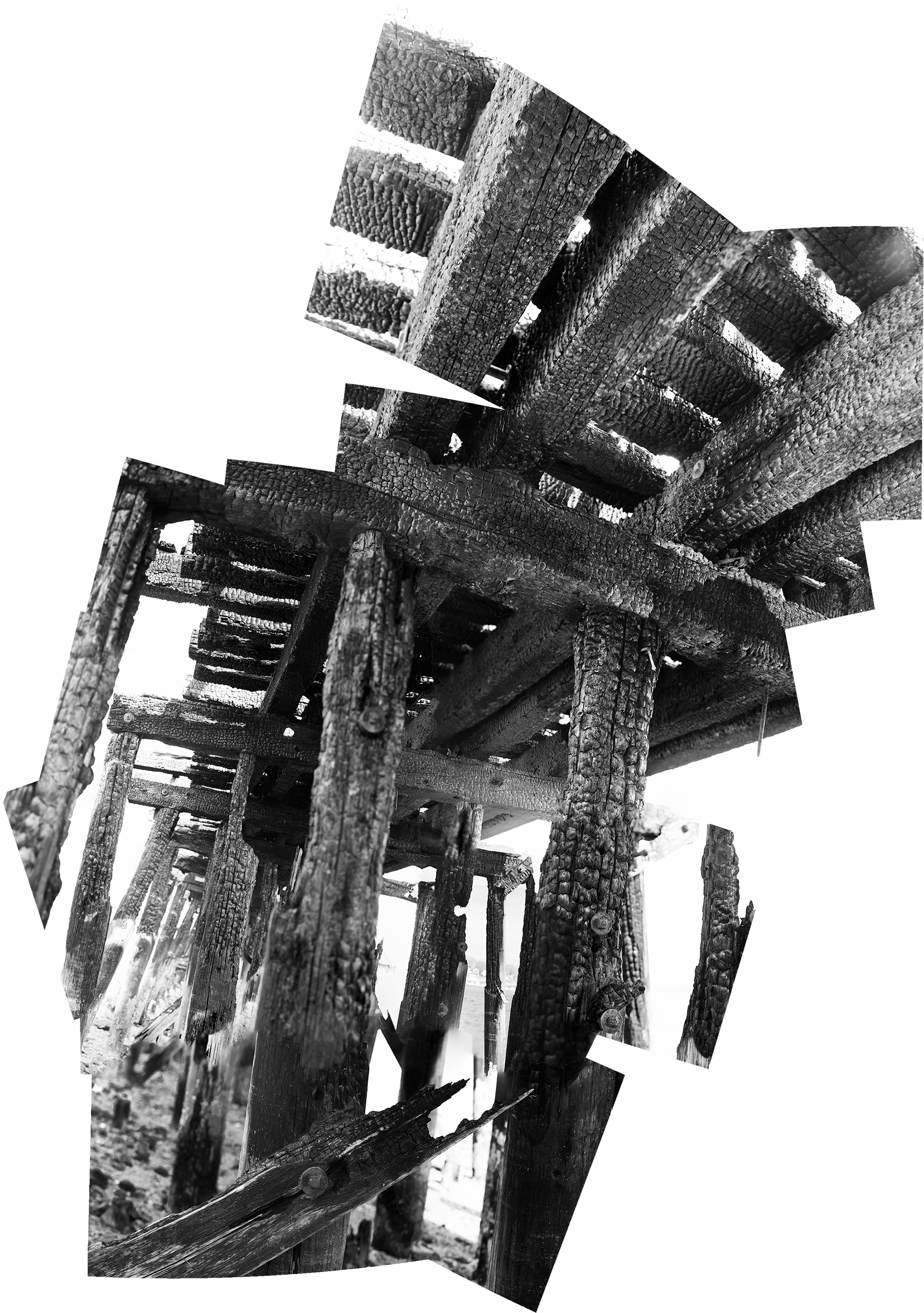
This image is frustrating on a whole bunch of levels...I like it and yet, I see so many things I am not sure I like...then there are aspects of this image which blow me away, and if not perfect here ( ok, not even close) things which suggest parts of speech to play with in ways I hadn't even though of.
Just standing under the trestles and rail road ties, I loved the sense of an enclosed space backed by the deep space and high sky. The assembled piece seems to build an illusion of space as the ties loom overhead, and yet they are still tightly and crisply textured.
What I didn't expect is the extent to which those images, or even portions of images, which assert a different depth of field can really assert complexities of space and the actual process of seeing. In the image above there are two beams that are crisply focused where the beams or portions of the beams to the left are out of focus, with a plane of focus another 10 feet behind those objects. From the start, these compositions are meant to reference, if not quote the multiple perspective spaces of modernist work starting with cubism. The complexity of the spaces built by the conflicting focal planes asserts the complexity of the pictures space in ways I hadn't even thought of...and THAT is a very good thing.
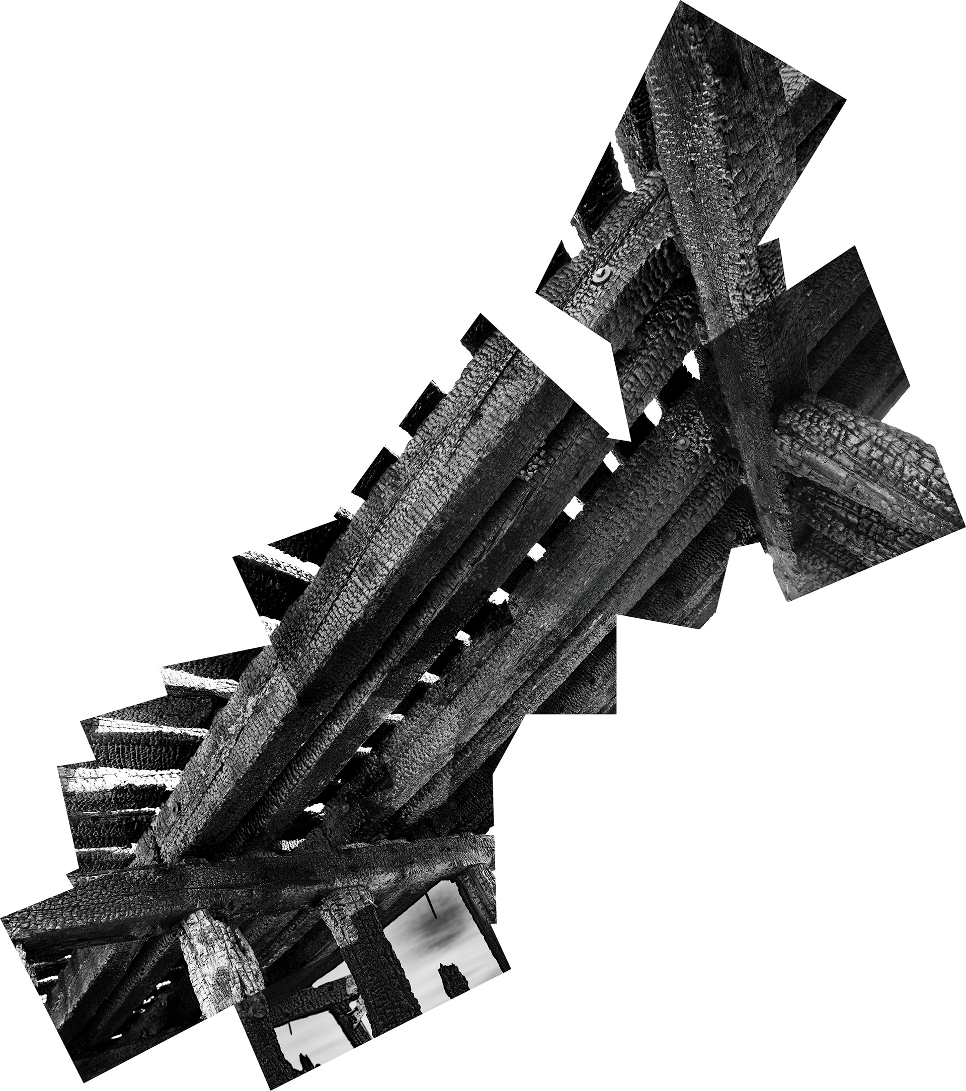
In a whole bunch of ways this image seals the deal, it makes me really happy and as any, ok, a lot of art school refugees with tell you....THAT doesn't happen very often.